Challenge Chosen
We chose Challenge 3 (Economics), and its accompanying sub-questions.
| Overarching Question | |
|---|---|
| Over time, are businesses growing or shrinking? How are people changing jobs? Are standards of living improving or declining over time? | |
| Sub -Questions | |
| 1 | Over the period covered by the dataset, which businesses appear to be more prosperous? Which appear to be struggling? Describe your rationale for your answers. Limit your response to 10 images and 500 words. |
| 2 | How does the financial health of the residents change over the period covered by the dataset? How do wages compare to the overall cost of living in Engagement? Are there groups that appear to exhibit similar patterns? Describe your rationale for your answers. Limit your response to 10 images and 500 words. |
| 3 | Describe the health of the various employers within the city limits. What employment patterns do you observe? Do you notice any areas of particularly high or low turnover? Limit your response to 10 images and 500 words. |
Visualisation Solution

In order to visualise the changes systematically, we take a multi-prong approach. More specifically, there are 4 “prongs” — one to teach the user how to use our app, and the rest for each question.
As seen above, all 4 prongs will be parked under a unifying dashboard, with each prong being accessible by a tab. The questions will be arranged sequentially, starting from the user menu (or introduction, Sub-Question 1 (ie Business Performance), Sub-Question 2 (ie Employee) and Sub-Question 3 (ie Employer).
We arrange our tabs in this manner to guide user into a top-down understanding of the economy in Engagement. The user first learns about the business ecosystem in Engagement using the Business Performance tab. Using that information, user will be able to make informed exploratory decisions to understand the situation from the employee, through the Income and Expense tab, and employer’s, through the Employer tab, perspectives.
Business Performance
Over the period covered by the dataset, which businesses appear to be more prosperous? Which appear to be struggling? Describe your rationale for your answers.
We use 2 sub-tabs to answer this - By Revenue and By Wages.
The ‘By Revenue (Overview)’ Tab
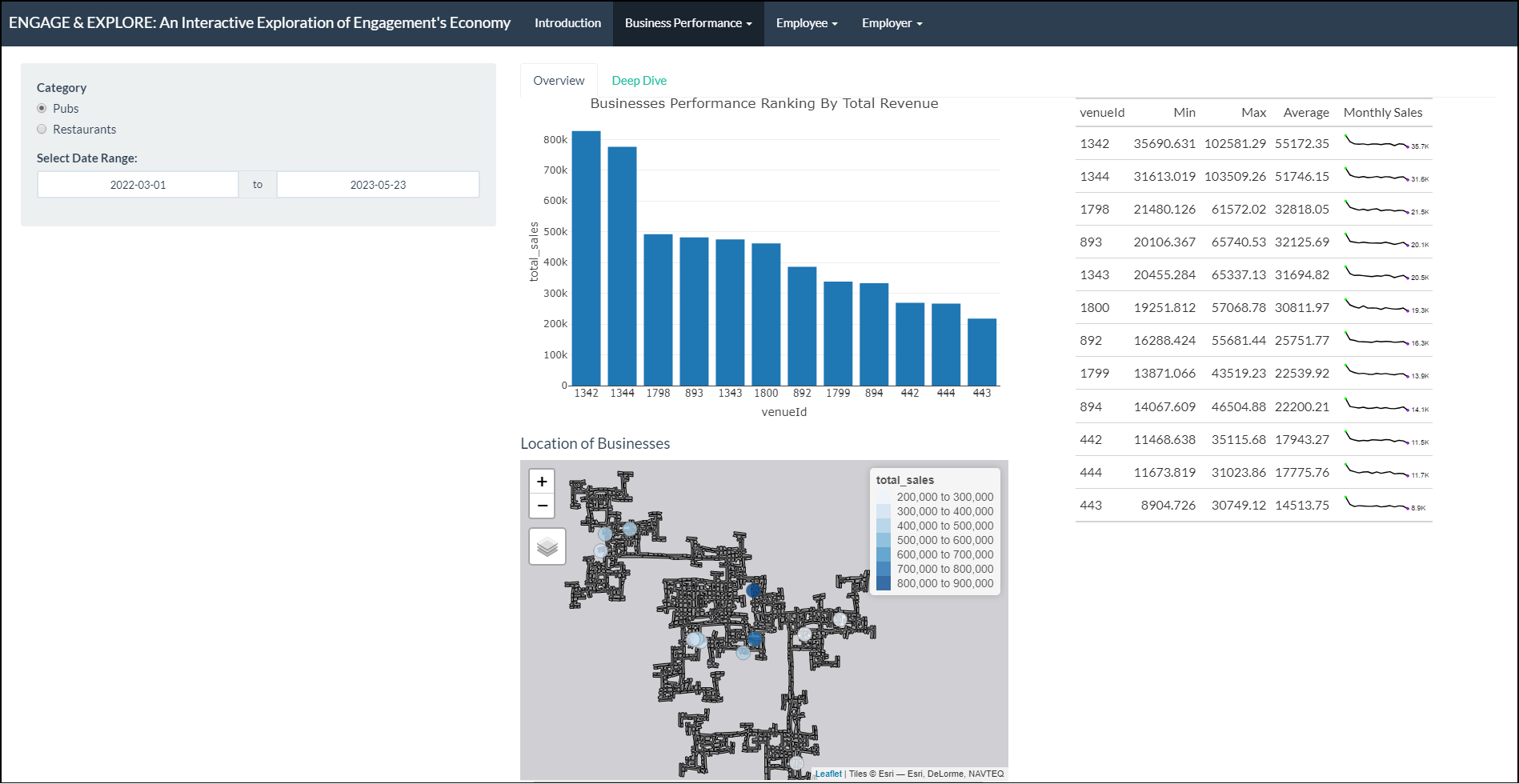
This tab has 4 parts:
- The controller that allows the user to:
- Select a category, either Pubs or Restaurants
- Select Date Range, for filtering the period of interest
- A bar graph displaying the ranking of businesses by total revenue in the city of Engagement.
- A data table and sparklines that shows the monthly sales trend of businesses over time.
- A map that shows the total sales by venue id.
1 - Control
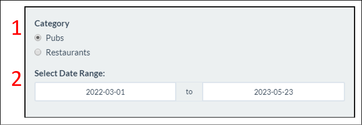
User has the option to view either ‘Pubs’ or ‘Restaurants’. This control will alter all 3 charts found within the pane.
User can scope to the interested date range. This control will alter all 3 charts found within the pane.
2 - Top Overall Performing Business
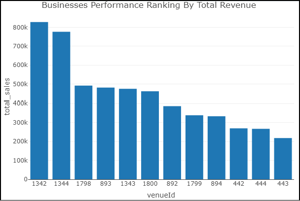
The Business Performance Ranking By Total Revenue bar chart arranges the ‘venueId’ based on the total revenue generated in descending order. User can identify the performing and struggling businesses. User can also hover over the bar charts to obtain the total revenue amount for each business.
3 - Monthly Sales Trend and Distribution
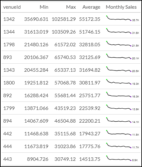
As the businesses in the Business Performance Ranking Chart are compared based on the overall sales accumulated, it provides little insights on how the businesses are performing over time. Thus, the data table and sparklines chart is displayed to reveal the monthly sales trend and provide the lowest and the highest revenue generated.
4 - Business Performance by Location
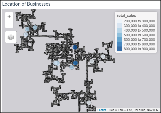
The map plot allows the user to explore and identify if there are any patterns in terms of business performance based on the location of the pubs or restaurants. The user also has the ability to zoom in and out of the plot as well as hover onto the circles to identify the ‘venue ID’ and the total sales collected.
The ‘By Revenue (Deep Dive)’ Tab
This tab has 3 parts:
- The controller that allows the user to:
- Select a particular company of interest
- Select parameters for the box plot.
- A violin-and-box plot that shows the statistical distribution of daily sales across the weekdays.
- A heatmap that displays the frequency of check-ins by days in the week and time of the day.
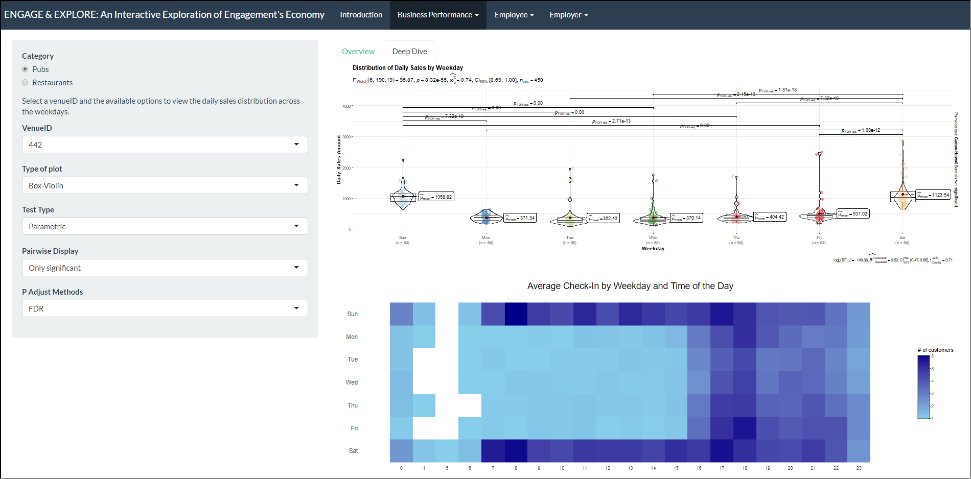
1 - Control
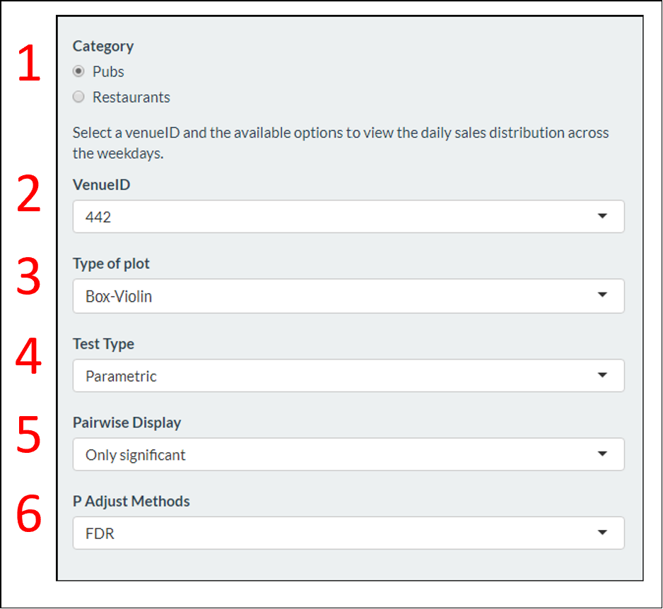
User has the option to view either ‘Pubs’ or ‘Restaurants’. This control will alter both charts found within the pane.
User can deep dive for a particular venueId or company of interest. This control will alter both charts found within the pane.
User can select the type of box-plot that they would like to view. This is only applicable to the Distribution of Daily Sales by Weekday chart.
User can select the type of statistical test in comparing the difference in sales between 2 weekdays. This is only applicable to the Distribution of Daily Sales by Weekday chart.
User can select the type of pairwise display for the box plot. This is only applicable to the Distribution of Daily Sales by Weekday chart.
User can select the type of P-Adjust methods for the box plot. This is only applicable to the Distribution of Daily Sales by Weekday chart.
2 - Distribution of Daily Sales by Weekday
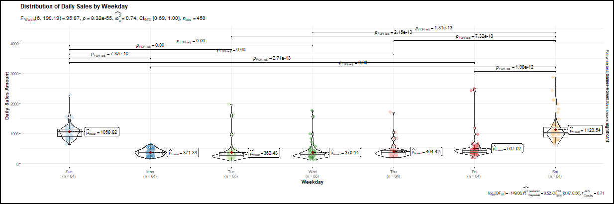
Users can compare the daily sales amount across on the weekdays.
3 - Check-in By Weekday and Time of Day
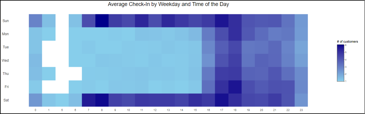
The Average Check-In by Weekday and Time of the Day heatmap provides visualization on the average visitors for the selected company across the weekdays at hourly intervals. The chart can be used to examine the peak and non-peak periods of the selected businesses. User can also hover over the heatmap to view the average number of visitors at a selected hour.
The ‘By Wages’ Tab
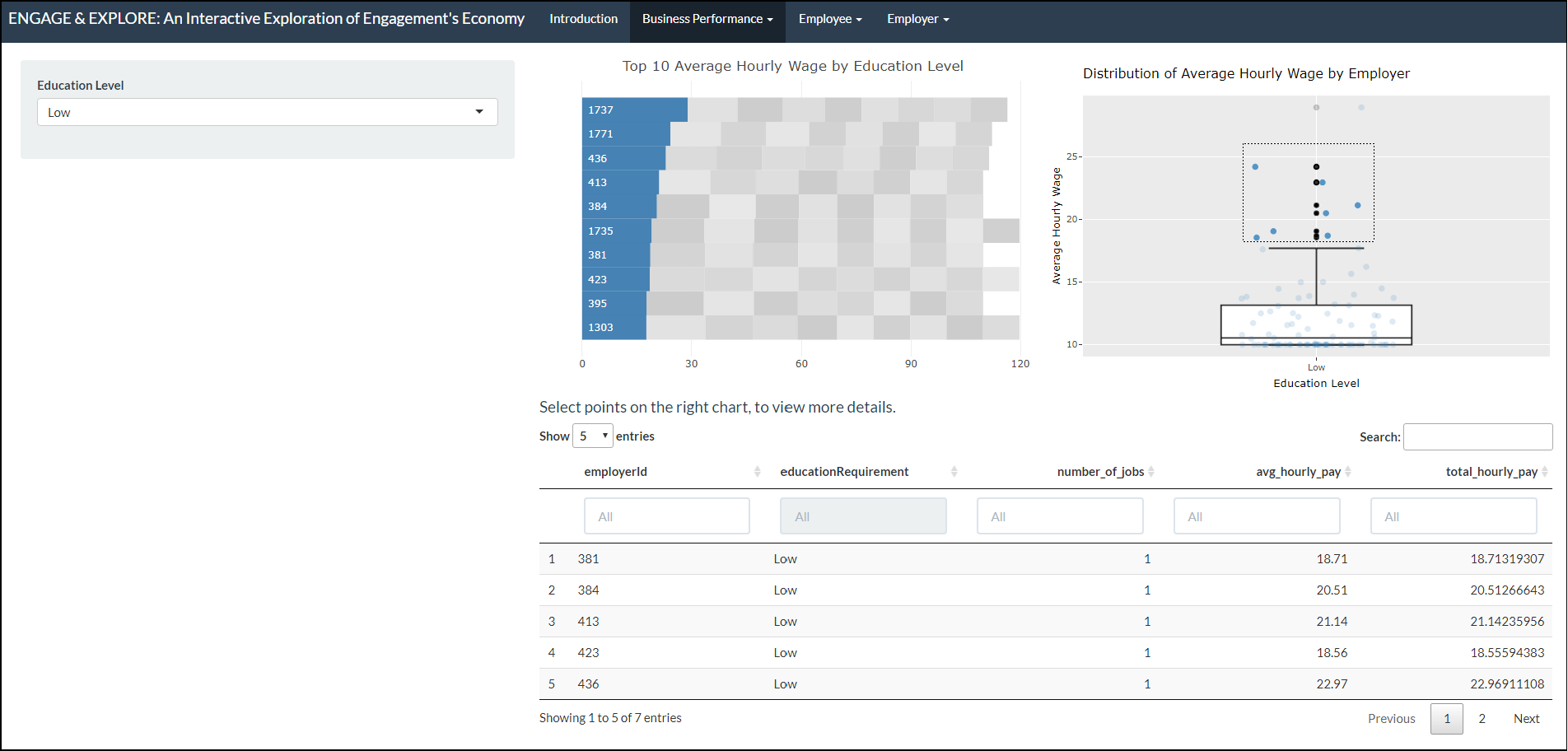
This tab has 4 parts.
- The controller that allows the user to:
- Select the education level
- A packed bar chart displaying the arrangement of businesses in
descending values of
average hourly wage. - A box plot that shows the distribution of the average hourly wage of all employers.
- A data table that displays the ‘venueId’, number of jobs, average hourly wage and total hourly wage details.
1 - Control
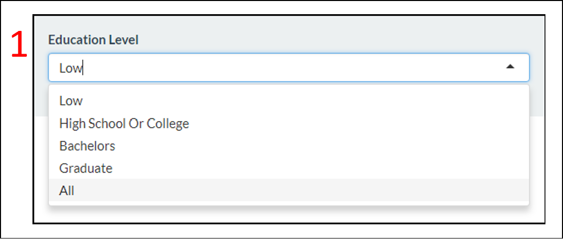
- User can filter based on the ‘Education Level’. This control applies to all of the 3 charts found within the pane.
2 - Packed Bar Chart of Average Hourly Wage
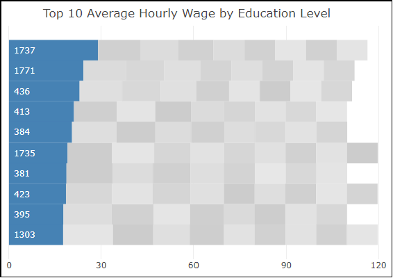
The top 10 employers that offer the highest average hourly wage are highlighted in blue. Users can hover over the bar chart to view the employer ID and the average hourly wage offered by the respective employer.
3 - Box-plot Depicting the Distribution of Average Hourly Wage
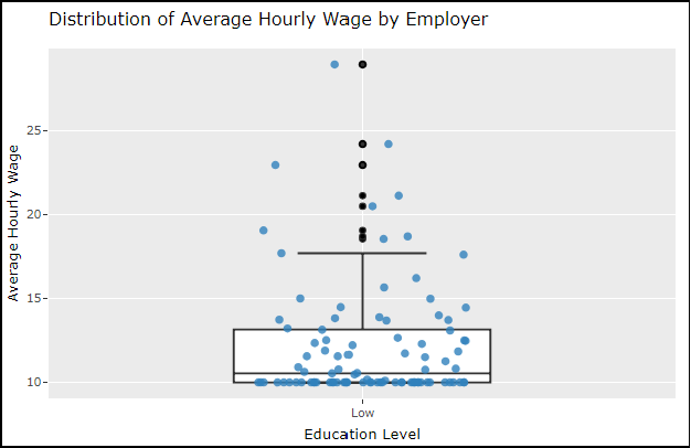
Users can hover over the box plot and data points to view the average hourly wage offered.Users can also select the data points to reveal more details on the selected points.
4 - Data Table
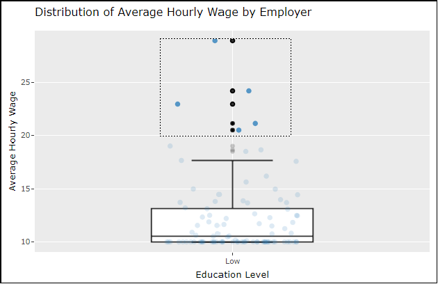
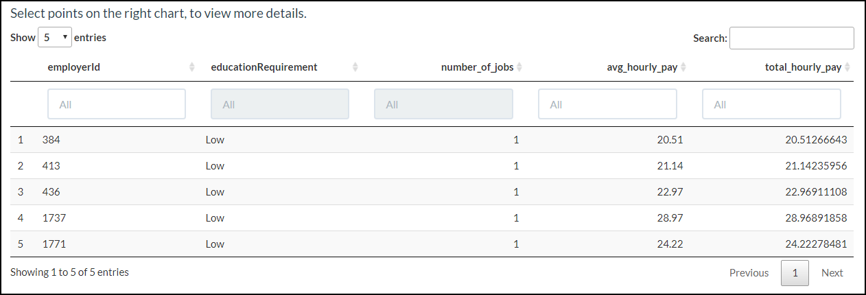
When a user selects a set of data points from the Distribution of Average Hourly Wage by Employer a data table appears showing information on employer ID, number of jobs, average hourly pay and total hourly pay.
Employees
How does the financial health of the residents change over the period covered by the dataset? How do wages compare to the overall cost of living in Engagement? Are there groups that appear to exhibit similar patterns? Describe your rationale for your answers. Limit your response to 10 images and 500 words.
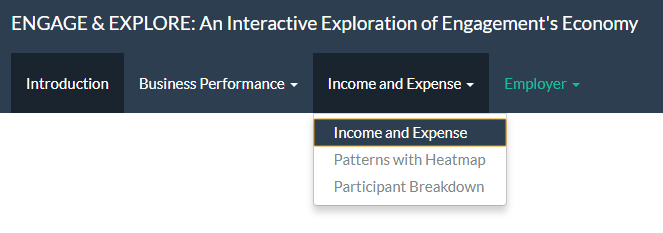 We use 3 sub-tabs to answer
this - Income and Expense, Patterns with Heatmap and
Participant Breakdown.
We use 3 sub-tabs to answer
this - Income and Expense, Patterns with Heatmap and
Participant Breakdown.
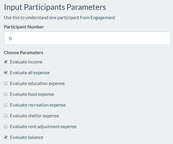
The ‘Income and Expense’ Tab
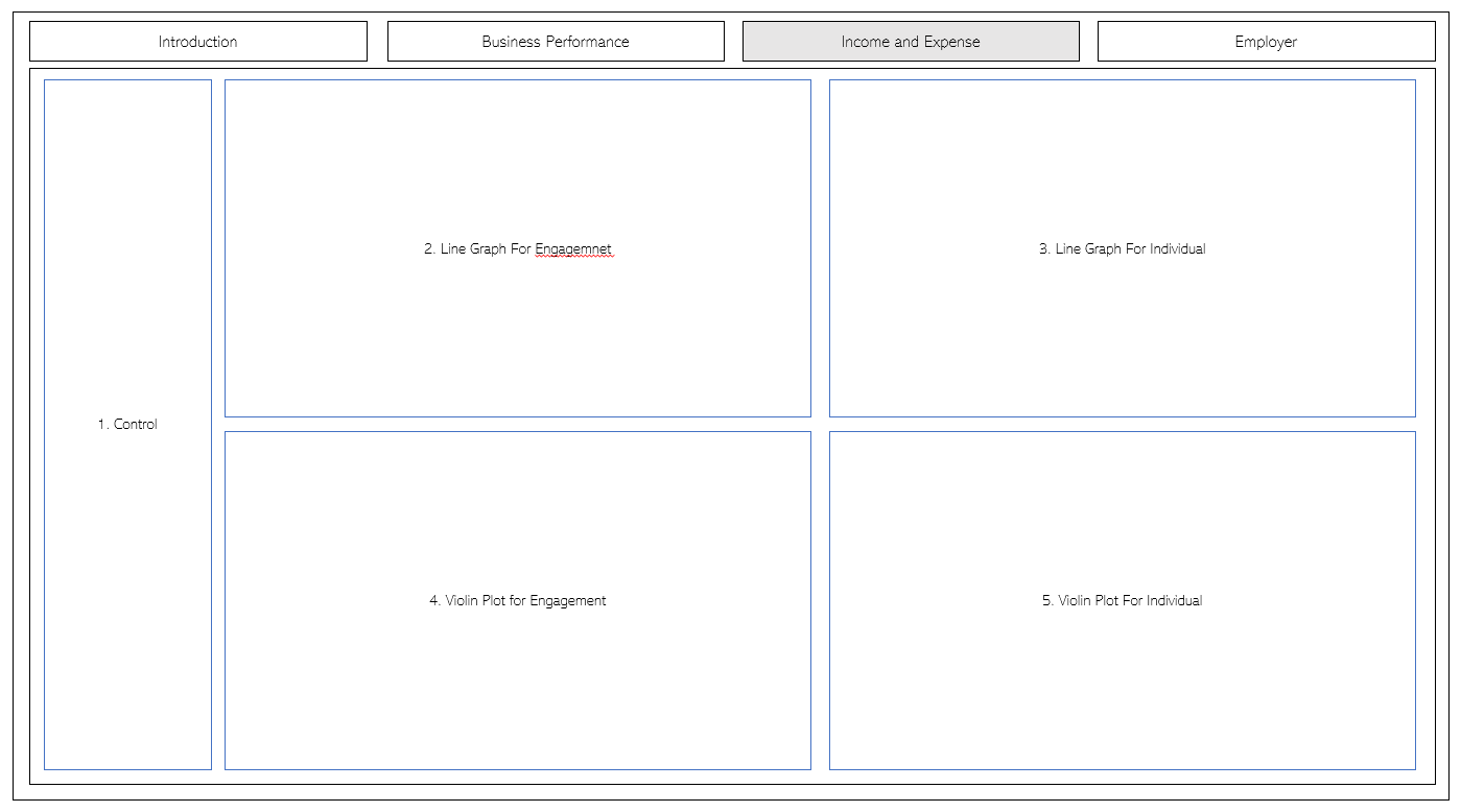
This has 7 parts.
- The controller that allows the user to interact with the different plots and graphs.
- A line graph for Engagement.
- A line graph for an individual.
- A violin plot for Engagement.
- A violin plot for individual.
1. Control
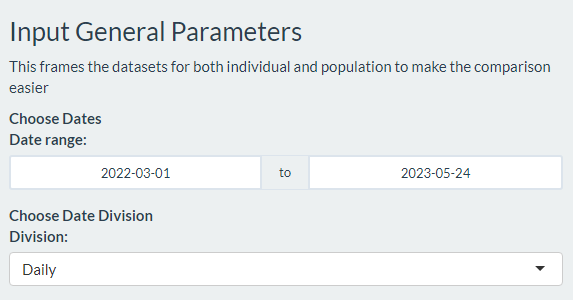
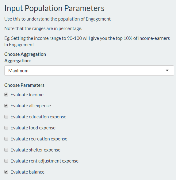
There are 3 parts to the controller. The first part allows me to select the time range, as well as the time divisions (daily, weekly etc) to be used for evaluation.
The second one allows us to decide what income and expense to evaluate for Engagement. On top of that, it allows us to evaluate the total, average, maximum and minimum value for each time division.
The last one allows the user to evaluate an individual participant’s income and expenses. This allows us to either evaluate the individual alone, or compare him or her to the general performance in Engagement.
2 + 3. Line Graphs
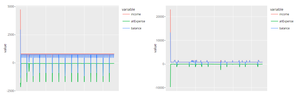
This allows the user to track subtle differences in income, total expenses and sub-expenses over time and answers the first 2 sub-questions.
4 + 5. Violin Plots
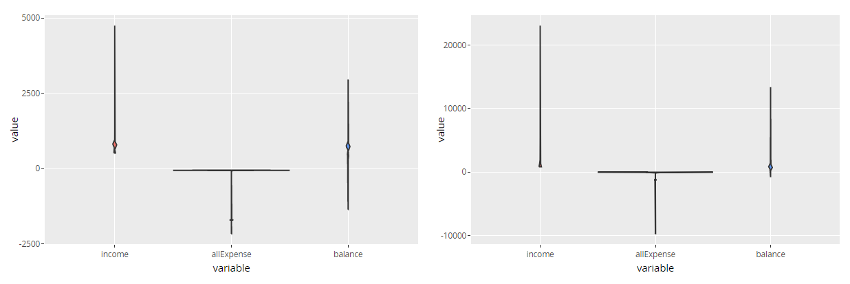
While the line graph is great, it does not encapsulate any statistical information.
We gather such information for the chosen income and expenses for both Engagement and the individual chosen with a violin plot. This way, we get to see the distribution, as well as the mean and variance in the different parameters.
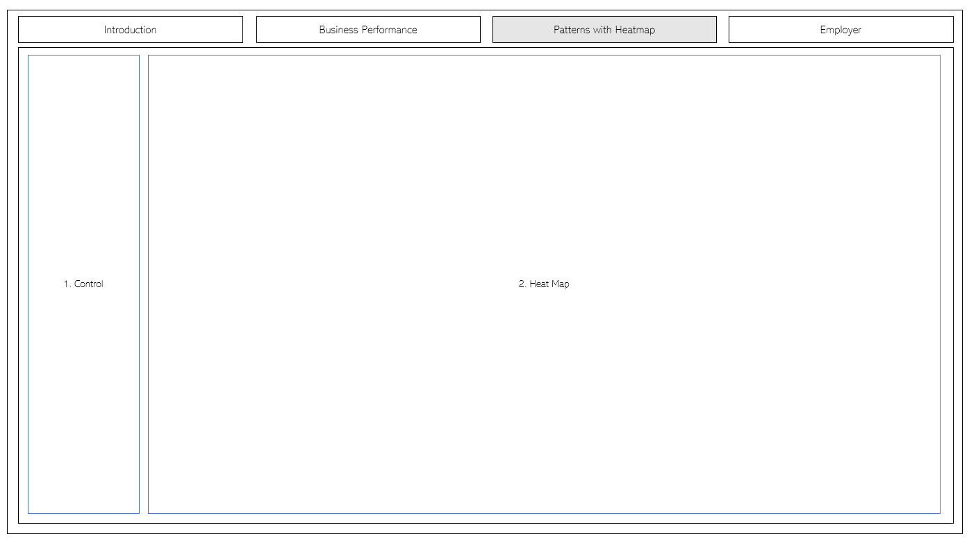
The ‘Patterns with Heatmap’ Tab
 The Patterns with
Heatmap tab has 2 parts.
The Patterns with
Heatmap tab has 2 parts.
- The controller that allows the user to interact with the different plots and graphs.
- 2 heatmaps representing the balance of individuals in Engagement - a Ranking Heatmap and a Clustering Heatmap.
1 - Control
There are 3 parts to the controller.
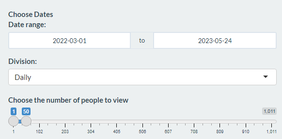
The first part allows us to choose the date range and the time division to evaluate. We also allow the user to explore different ranges of people, from the top 50 all the way to the 237th member.
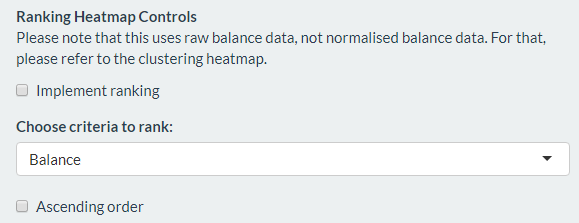
The second part controls for the Ranking Heatmap. In order to seek a “pattern”, we let the user rank the participants based on a certain factor. The user can do this ascendingly or descendingly.
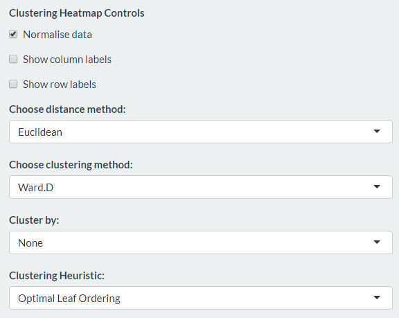
The last part controls for the Clustering Heatmap.
Firstly, we allow the user to normalize the data since this can improve the accuracy and visibility of our data set.
In order not to clutter up the heatmap, we let the user remove and add the x-axis and y-axis labels.
The user can choose the distance method and clustering method, and can also choose to cluster by either the rows or the columns of the heatmap, or both.
Lastly, we allow the user to sort the dendogram in order to get a better understanding of the clusters that happen in the data set.
2 - Heatmap
Ranking Heatmap
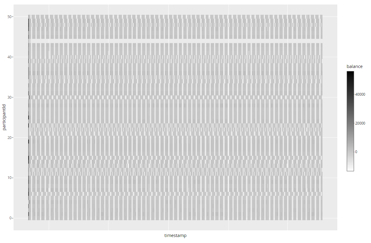
Each row in the heat map represents a participant. Each column in the heat map represents a time period. To adjust the number of participants in the heat map, we can use the “Top X filter” in the Heat Map Controller.
More importantly, the magnitude of the colour is representative of the amount of balance or debt. For example, a participant with more debt in a certain time period will have a denser red-coloured grid than a user with less debt.
Clustering Heatmap
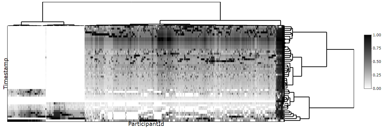
We use this in the case where the previous heatmap does not allow us to determine a good enough pattern.
Each row in the heat map represents a participant. Each column in the heat map represents a time period. Using the dendograms, the user can find interesting clusters by hovering over the zone, and find out more about them by inputting their values in the Participant Breakdown tab.
The ‘Employee Breakdown’ Tab
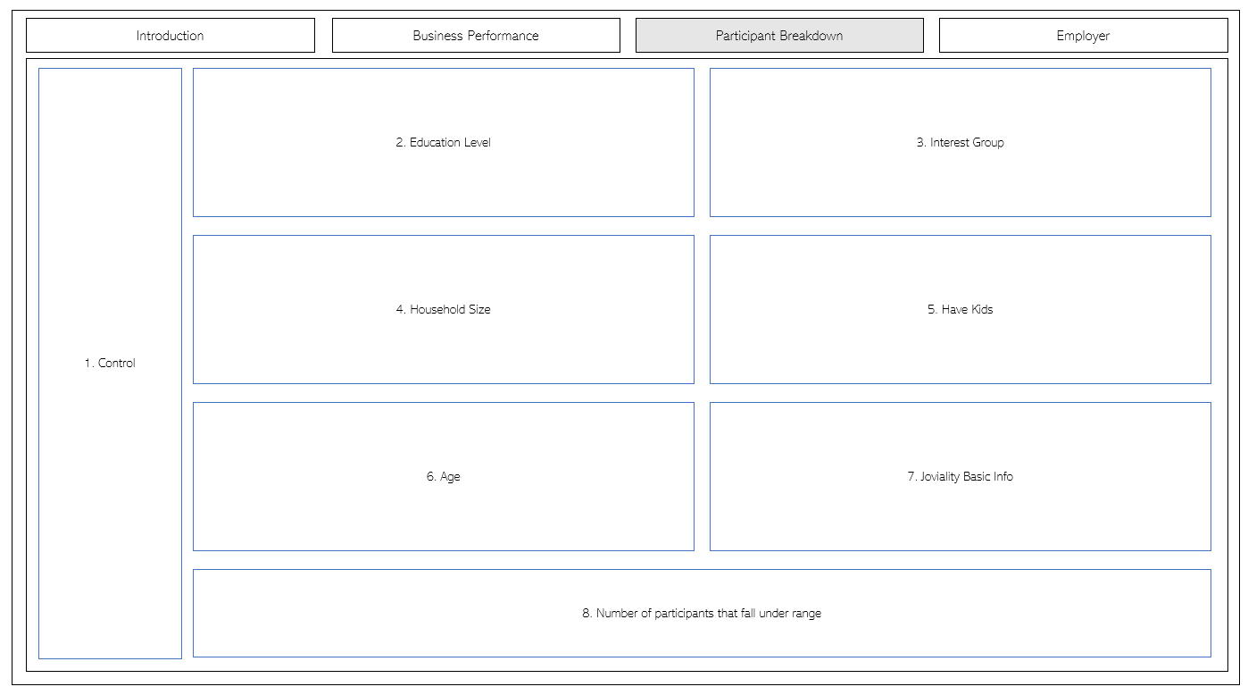
The Employee Breakdown tab has 2 large parts.
- The controller that allows the user to interact with the different plots and graphs.
- May other barplots that represent the basic traits of the participants chosen in the previous heatmap.
1 - Control
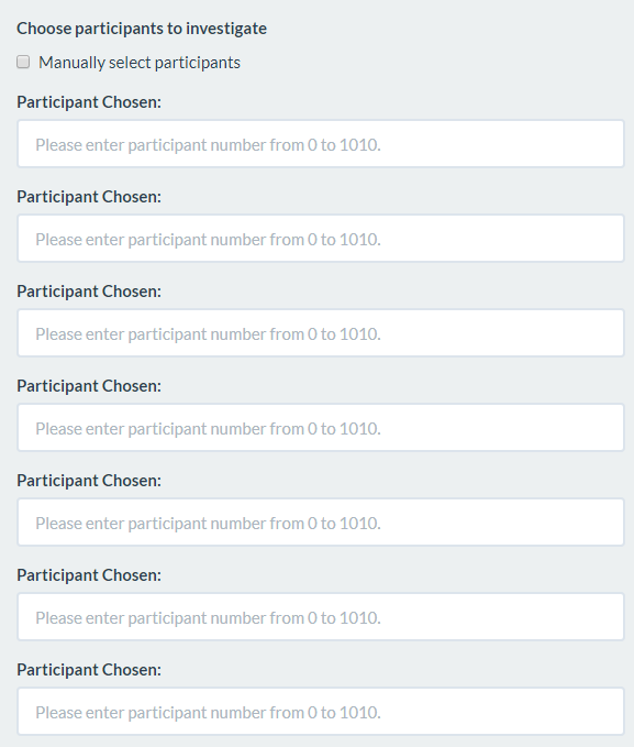
The barplots will naturally changes according to the decisions we made in the previous heatmap. We also allow the user to customise the group of people he or she wants to evaluate by letting them manually input the id of those participants.
2 - Barplots of Traits Representative of Participant
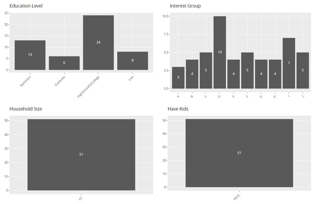
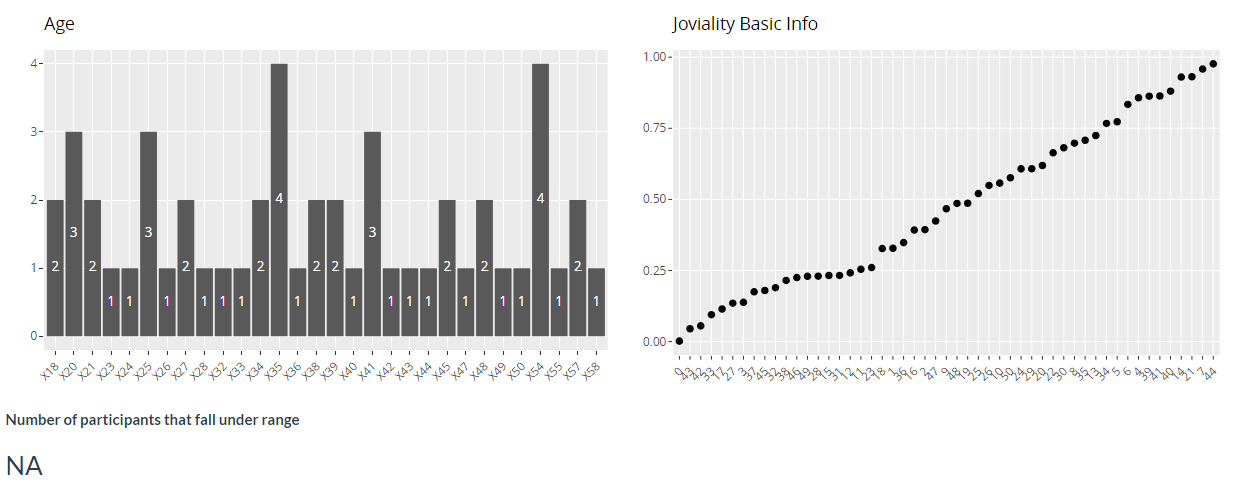
The heatmap is helpful for pattern recognition. The traits highlighted here allow us to explain those patterns.
Employer
Describe the health of the various employers within the city limits. What employment patterns do you observe? Do you notice any areas of particularly high or low turnover?
We use 2 sub-tabs to answer this - Map View and Turnover Rate.
The ‘Map View’ Tab
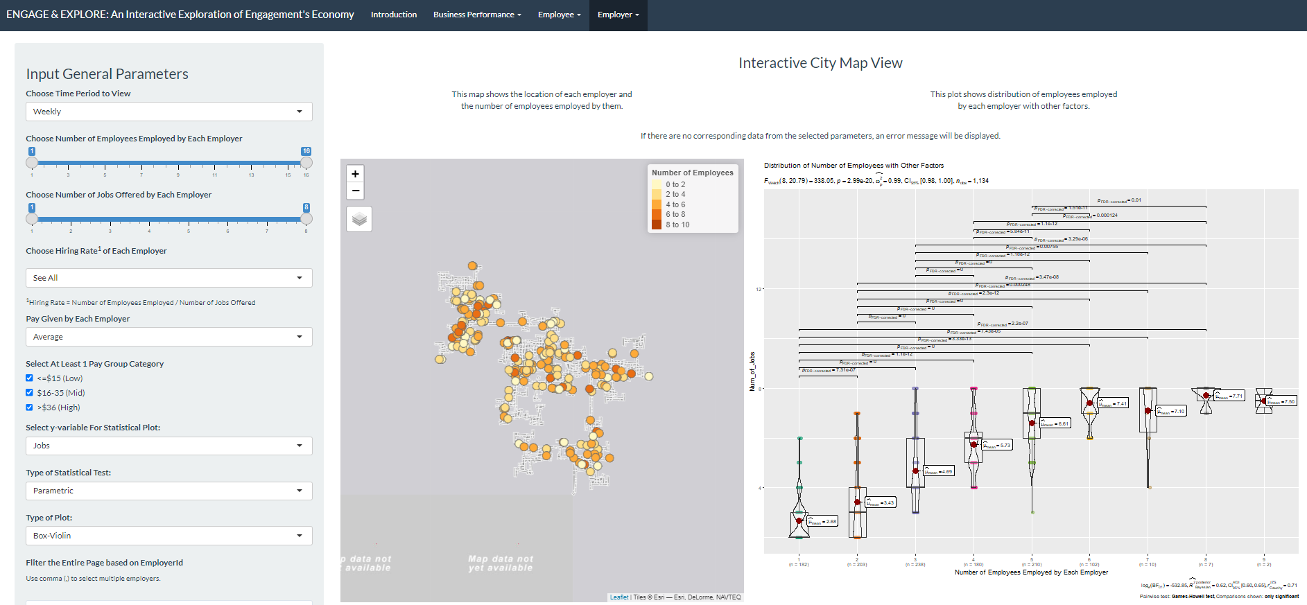
This tab has 4 parts.
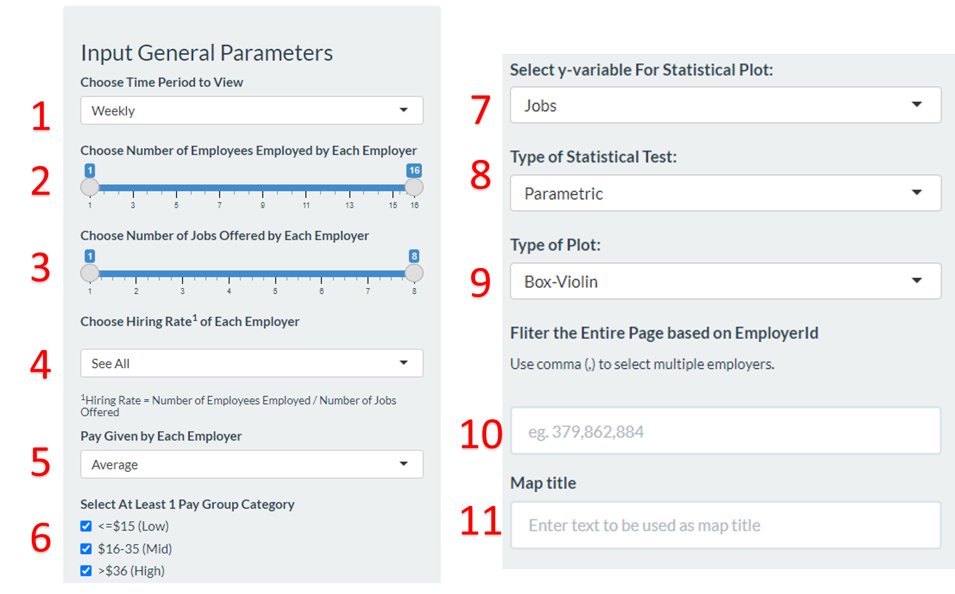
- The controller with 11 parameters that allows the user to interact with the map, plot and data table.
- A map that shows the location and number of employees employed by the employer.
- A plot that shows distribution of employees employed by each employer with a selected factor.
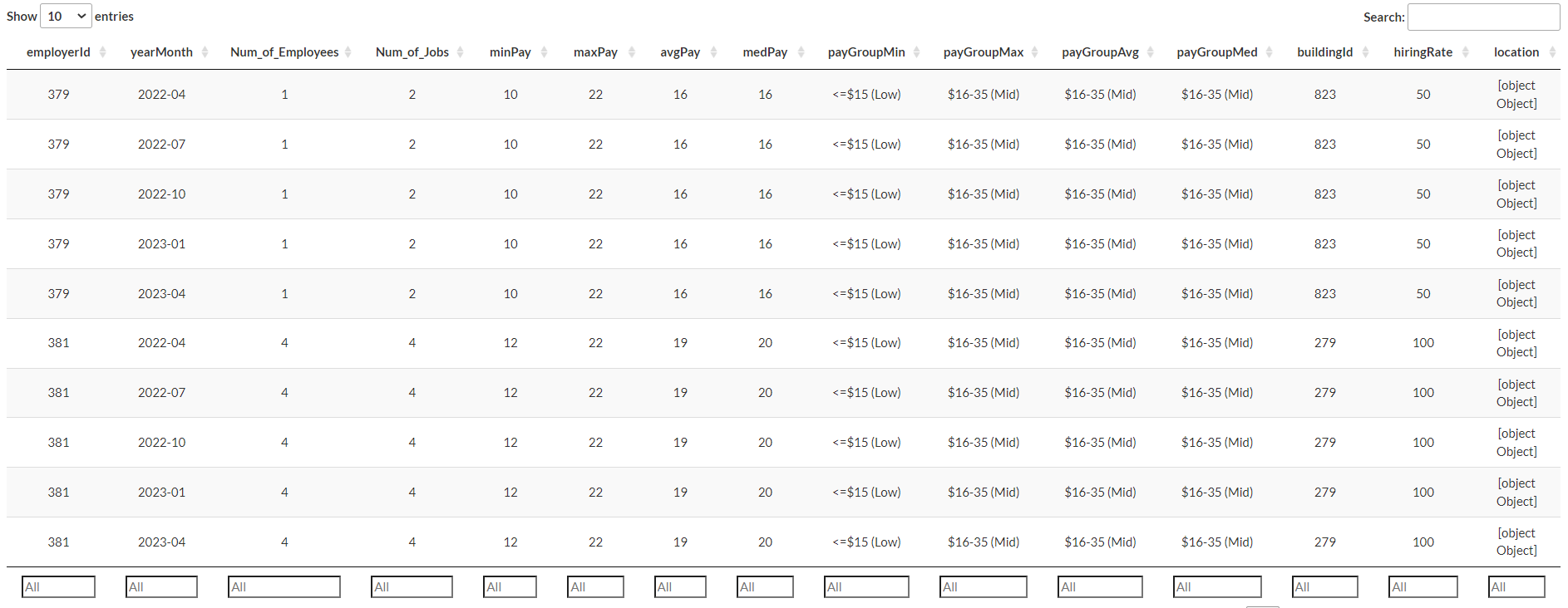
- A datatable with information on each employer such as the number of employees and jobs they have, the pay ranges and hiring rate.
1 - Control
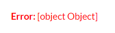
 The entire tab will be updated
accordingly to the parameters chosen. If there is no data from the
selected parameters, an error message will be reflected:
The entire tab will be updated
accordingly to the parameters chosen. If there is no data from the
selected parameters, an error message will be reflected:
User can choose ‘Daily’, ‘Weekly’, ‘Monthly’ or ‘Weekday’ time period to view, the default selection is ‘Weekly’.
User can select the range or specific number of employees employed by each employer, the default selection is to show all employees under each employer.
User can select the range or specific number of jobs offered by each employer.
User can select the hiring rate of each employer. Hiring rate is defined as the Number of Employees Employed divide by Number of Jobs Offered.
This shows the minimum, maximum, average and median hourly rate pay across all jobs under each employer. User can choose the computation; the default selection is average pay.
User can select the pay group category, the default selection is to show all groups.
This control the y variable of the statistical plot which is defaulted at the “Number of Jobs offered by each employer”, the x variable is fixed at the number of employees employed by each employer.
User can specify the statistical test that he/she wishes to see. The default selection is parametic test.
User can specify the type of plot he/she wishes to see for the statistical plot.The default selection is box-violin plot.
User can filter the entire tab based on ‘EmployerId’. To see more than one employer, user is to add a comma after each ID eg. 379,862,884.
User can key in any text which will be auto updated as title above the map.
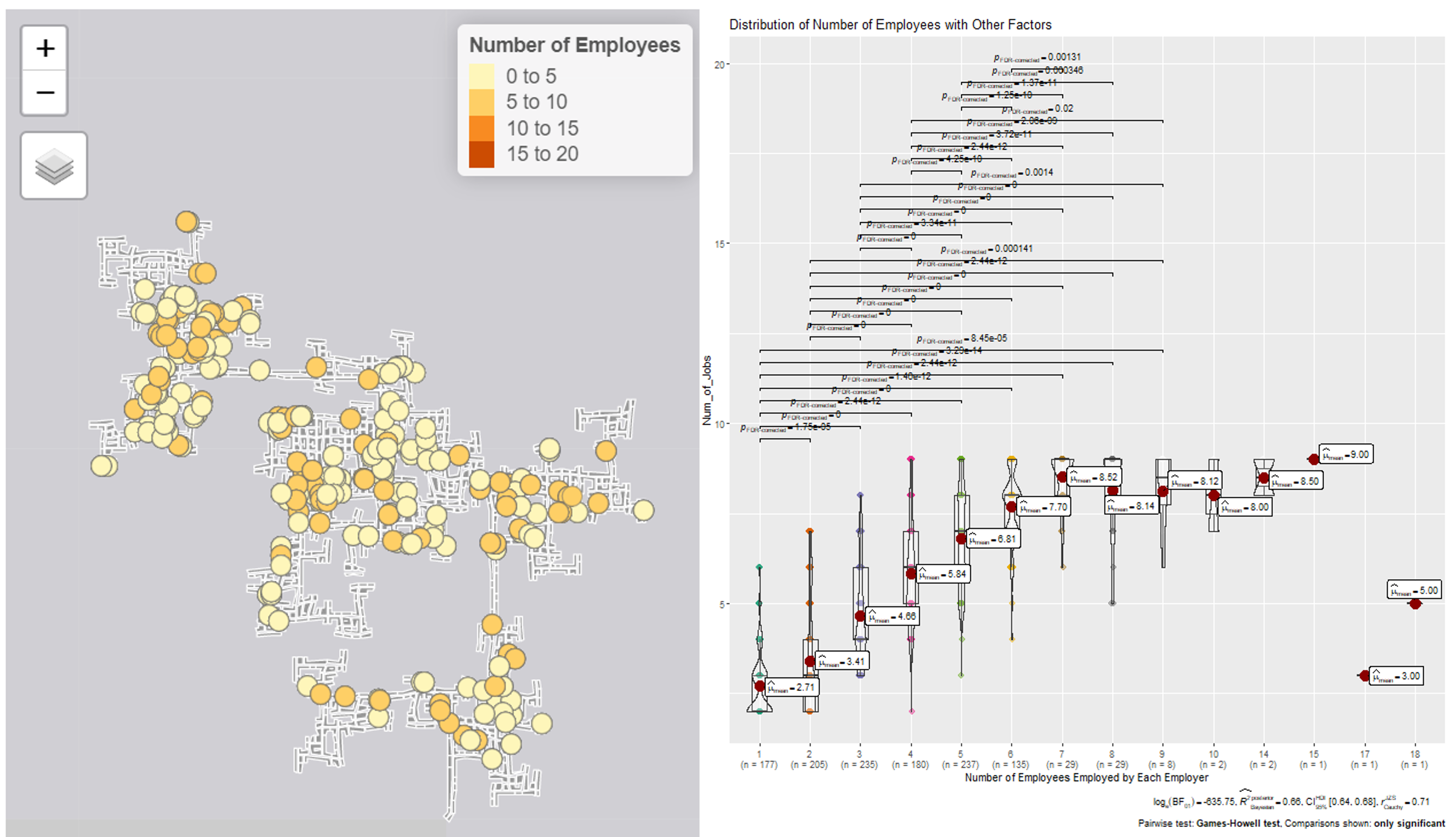
2 - Map
A map of the city is displayed on the left, with a legend showing the number of employers in each company. User can hover to the bubbles to see the respective employerId. This way, the user might be able to look beyond the company and see how different employers interact.
On the right is the statistical plot that shows the distribution of number of the employees employed.
3 - Data table
User can filter the table via the input field at the bottom of each column. This serves to provide more information to help the user find patterns.
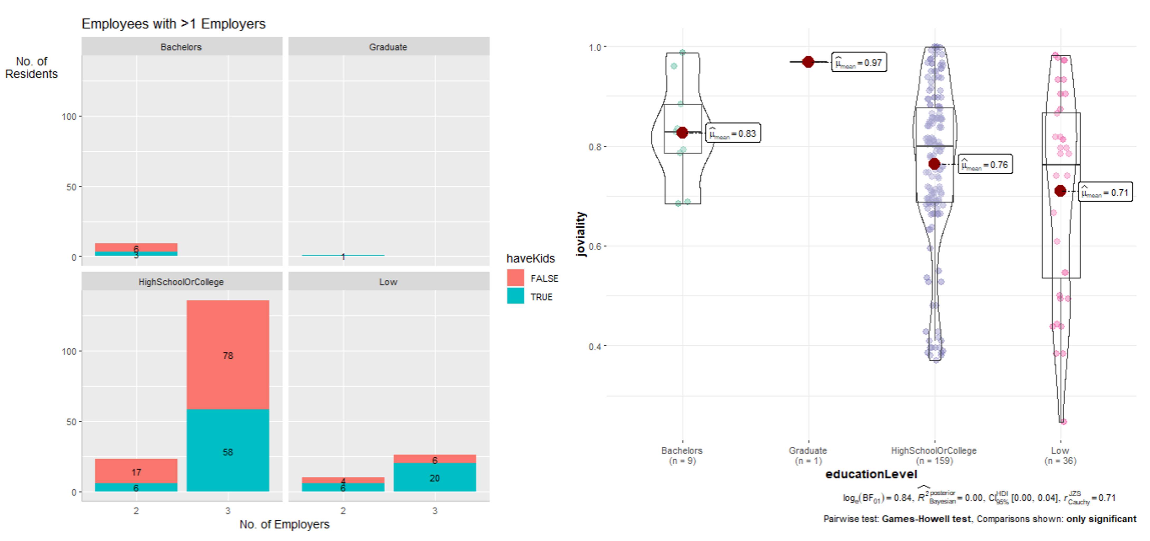
The ‘Turnover Rate’ tab
This tab has 3 parts.
- The controller with 7 parameters that allow user to filter the plots.
- The facet plots that classified the employees into different educational level and show whether they have kids.
- The statistical plot that shows distribution of selected variables.
The datasets used for this tab are already filtered to only 1) employers with the number of different employees and 2) employees that has more than one employer during the 15 month data collection period.
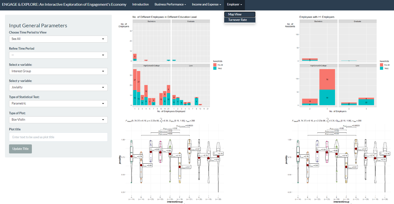
1 - Control
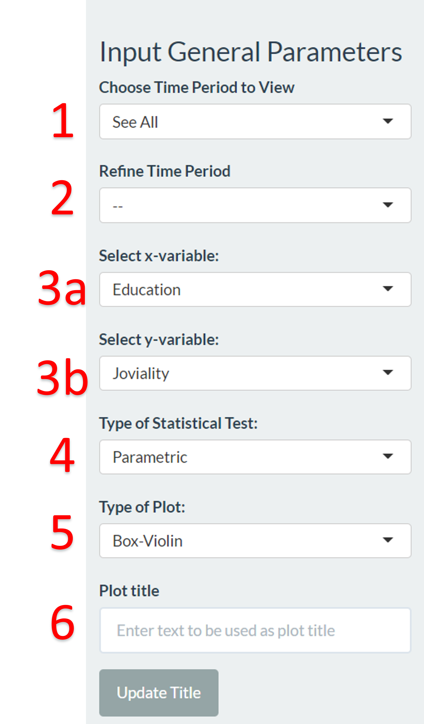
User can choose the ‘Date’, ‘Week’ or ‘Month’ or ‘Weekday’ to see the time period where there are changes to the employees/employers.
User can further refine to specific time period eg. specific date, week number or month to see the change to the employees/employers.
User can choose the x and y variable of the statistical plot. The default selection is “Educational Level” as x variable and “Joviality” as y variable.
User can specify the statistical test that he/she wishes to see. The default selection is parametic test.
User can specify the type of plot he/she wishes to see for the statistical plot.The default selection is box-violin plot.
User can key in any text and click the “Update Title” button to customize the page title.
2 - Plots
The plots displayed on the left shows employers with the number of different employees during the selected time period.
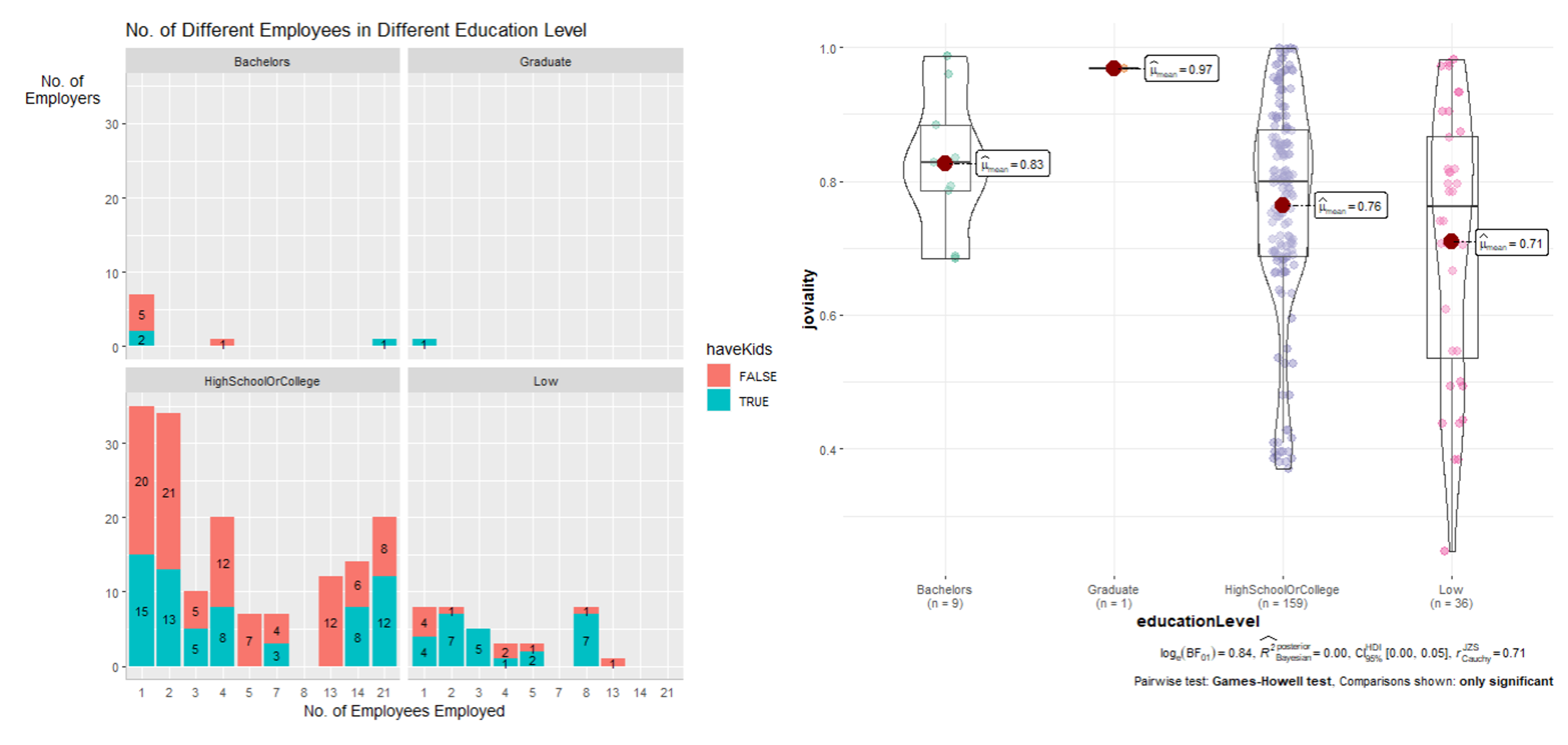 The plots displayed on the
right shows employees that has more than one employer during the
selected time period.
The plots displayed on the
right shows employees that has more than one employer during the
selected time period.